Creative Resume Template
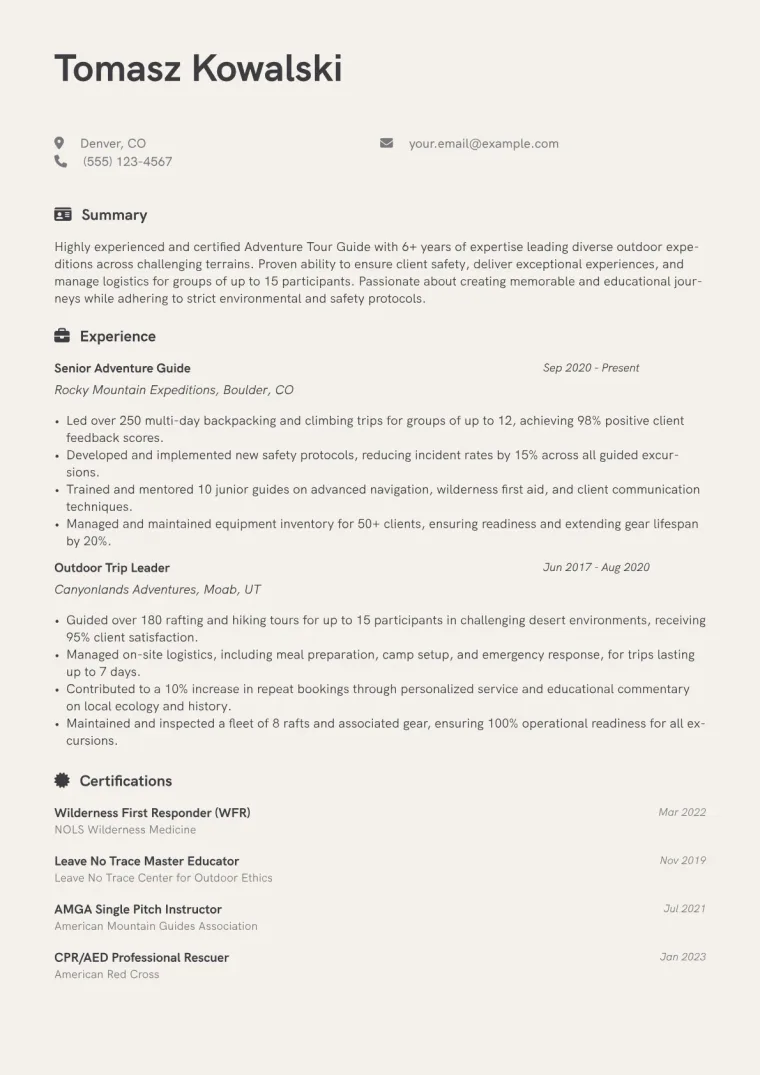
A soft beige page rather than stark white, with a clean grotesque typeface and restrained accents. The warmth comes from the paper colour, not from decoration, so it stays legible and grown-up.
Use the Creative template
Drop in your resume and get it back in this design, ready to edit.
Free, and no account needed to start.
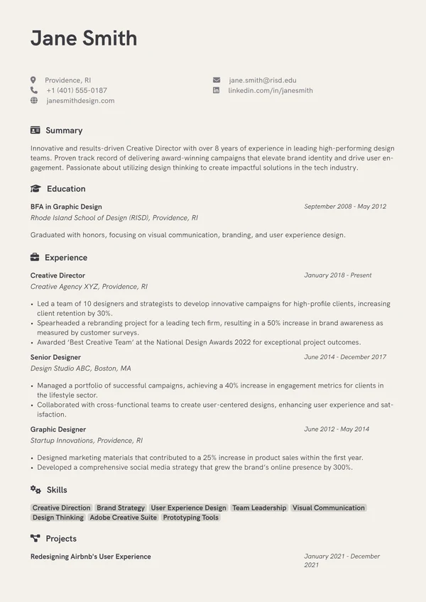
When to use it
Pick this when a pure white page feels clinical for the work you do, but you do not want blocks of colour or graphic flourishes. The tinted ground reads as considered rather than loud.
- Creative and studio roles
- Copywriters, editors and content designers
- Anyone wanting warmth without decoration
- Portfolios with a soft or natural palette
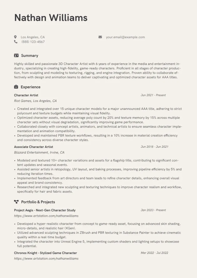
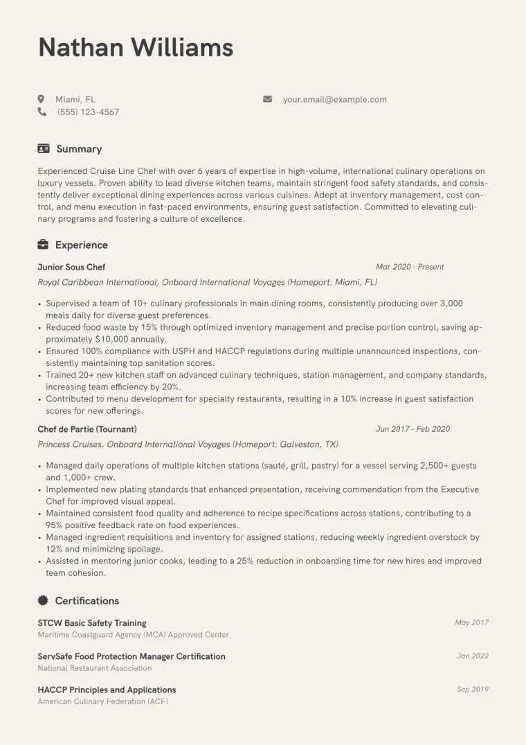
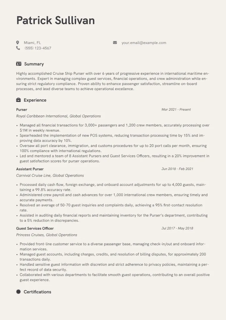
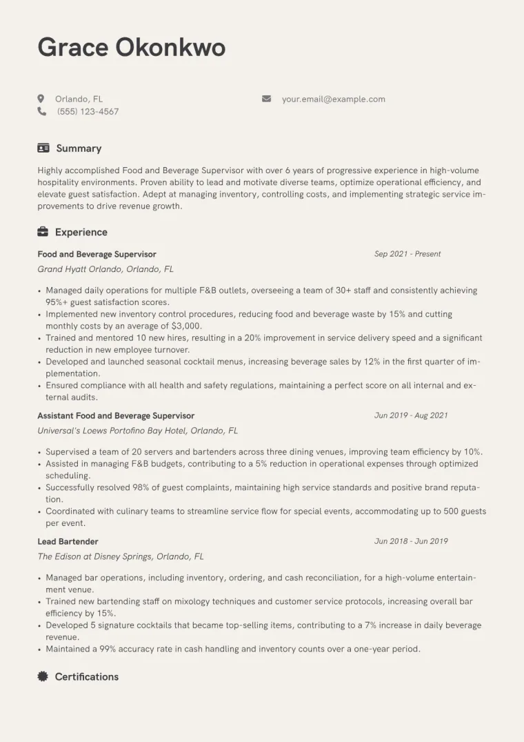
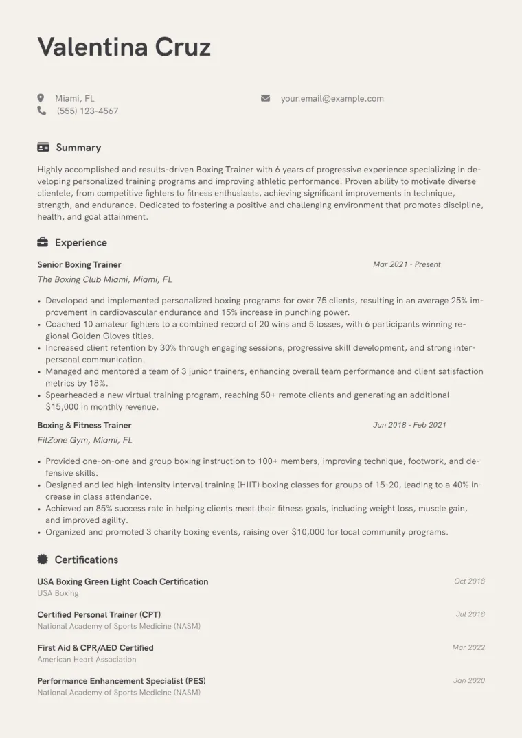
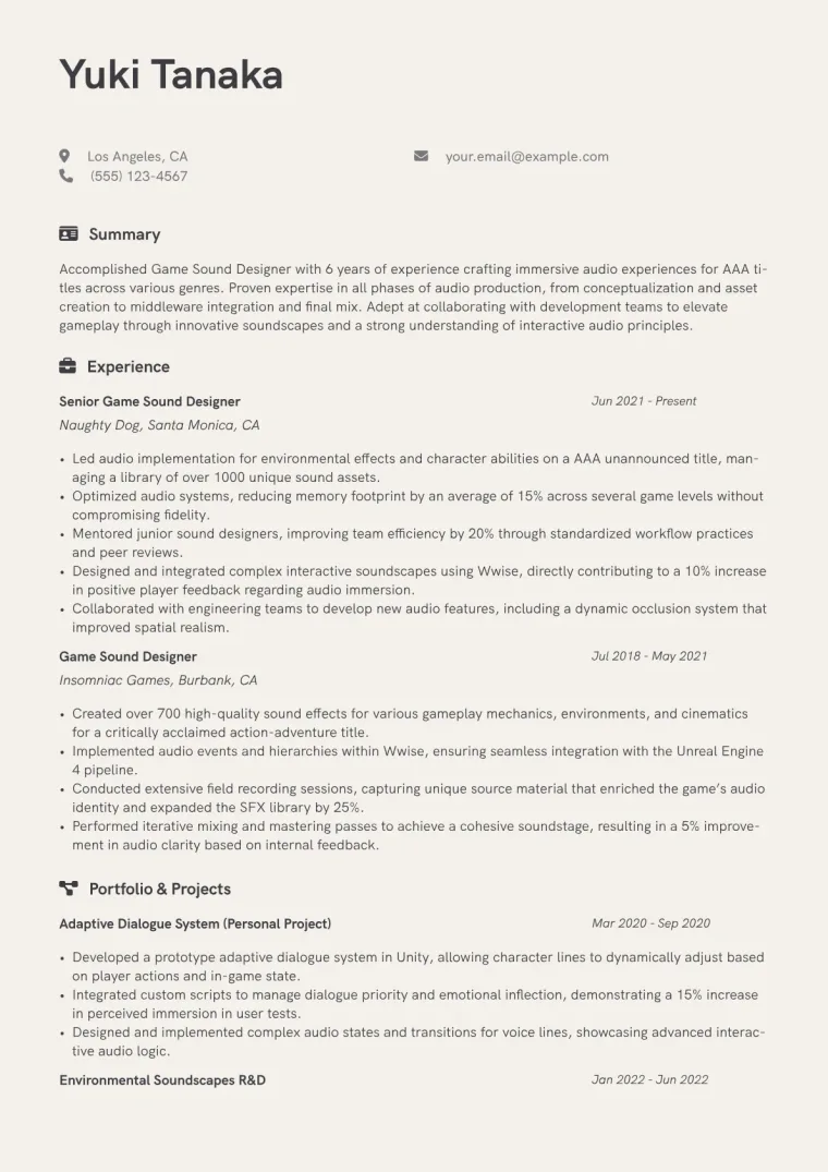
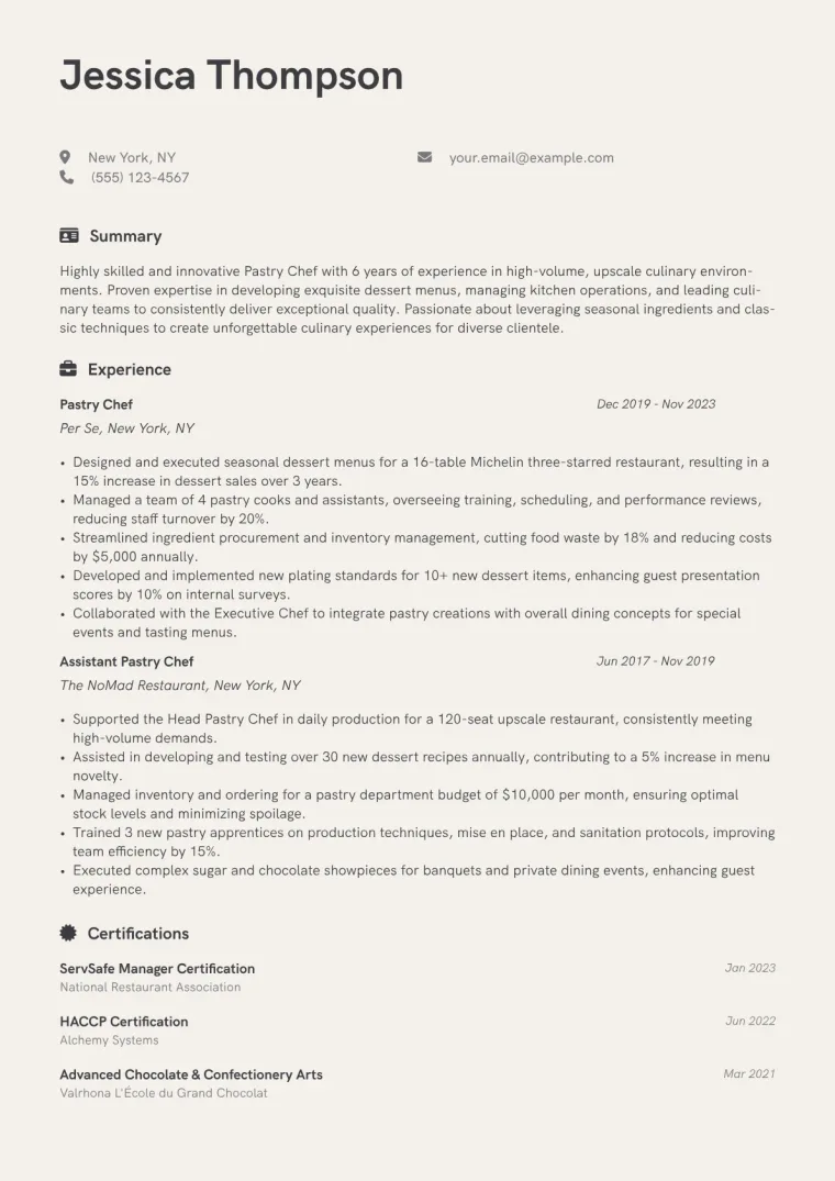
Resume examples using Creative
Filled-in examples, so you can see how the design handles actual content.
Similar designs
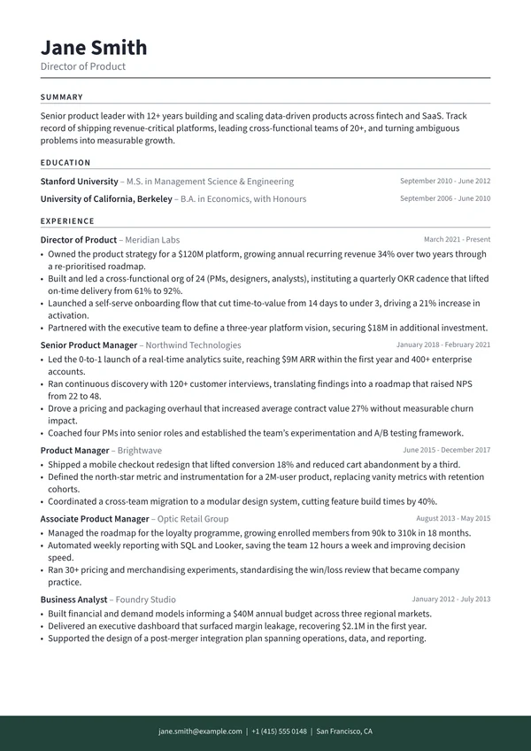
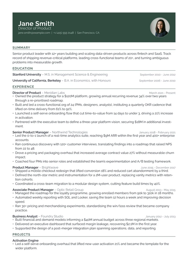
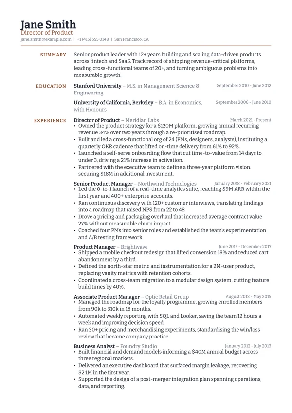
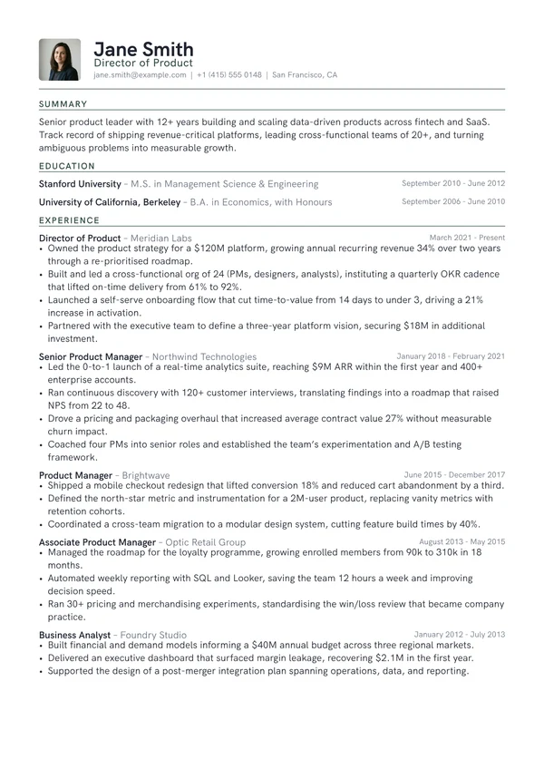
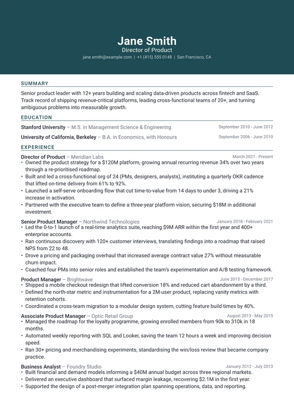
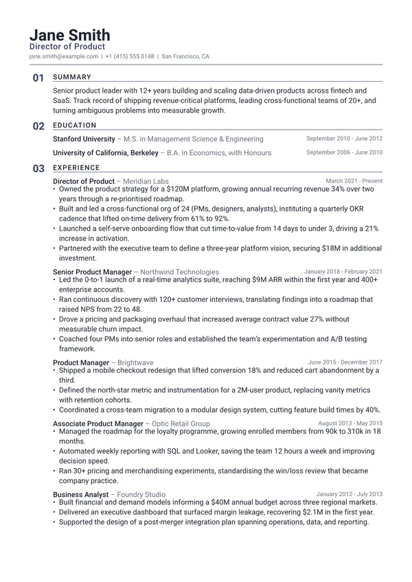
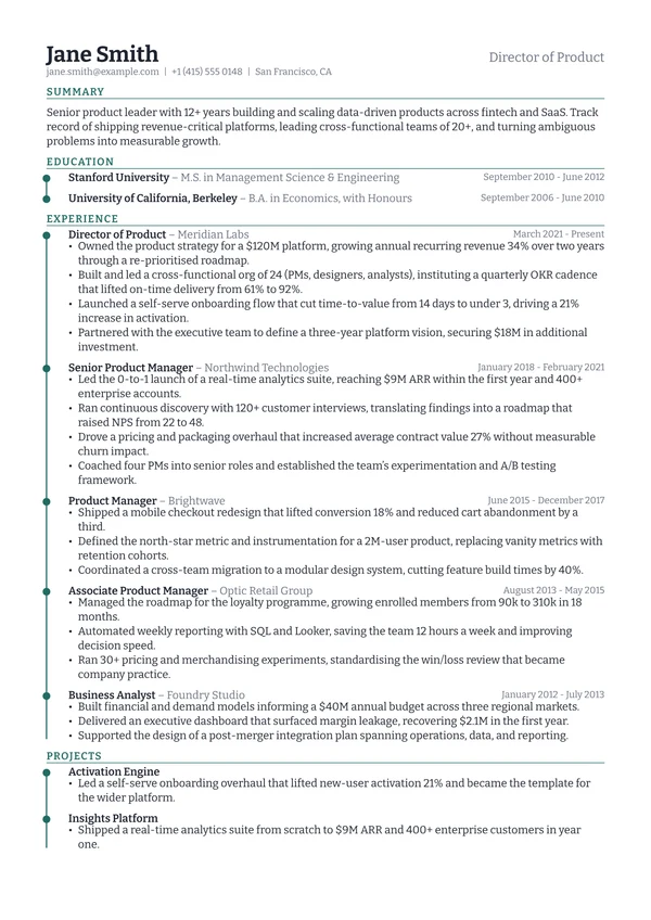
Frequently asked questions
Is the Creative resume template ATS-friendly?
Creative is a single-column design that reads cleanly, but it is not in our ATS-friendly set. If your application goes through a large employer's portal or a recruitment agency, pick one of the ATS-friendly designs instead and keep this one for direct approaches.
Is the Creative template free?
Yes, if you start your CV from this page: Creative then stays free to download for that CV. Picking Creative later, inside the app, is what needs Pro.
Can I download the Typst source for the Creative template?
Yes. Creative is typeset in Typst, and the .typ file is on this page and in the template repo on GitHub. It is one self-contained file with no imports, so it compiles on its own with Typst 0.12 or newer. This design is a port of grotesk-cv, so the source stays under that project's licence (Unlicense) and ships with a notice recording what changed.
What font does the Creative template use?
Creative is set in HK Grotesk, in a single-column layout with balanced spacing. You can change the typeface, text size, spacing and accent colour after your CV is created.
Are these resume templates free?
Yes. Preview any template with your own CV, and start your CV here to download that design free. The other designs need Pro.
Can I edit a resume template after I download it?
Yes. Your CV stays in your account, so you can rewrite the content, change the font size and spacing, and download a fresh PDF whenever you need one.
Will these templates pass an ATS?
The designs marked ATS-friendly are built for it: no colour fills behind text, a clean reading order and standard section headings. Any CV you build can also be checked against a real parser with our free ATS resume checker, which shows you exactly what a screening system extracts.
What file format do I get?
A print-quality PDF, which is what nearly every employer and application portal asks for. The PDF keeps a real text layer rather than being an image, so screening software can read it and so can a screen reader. Pro adds a Word .docx export for the applications that ask for one.
Can I write my resume in a language other than English?
Yes. The AI writes in 36 languages. Japanese, Korean and Chinese are typeset with the right fonts, and the regional formats are built in: Europass, the Japanese rirekisho and shokumu keirekisho, and the Korean iryeokseo.
Should I put a photo on my resume?
In the UK, Ireland, the US, Canada and Australia, no. Employers there usually prefer no photo, and some screening processes strip them to reduce bias. In much of continental Europe and parts of Asia a photo is still conventional. Check the norm where you are applying, and leave it off if you are unsure.
Are these resume templates open source?
The Typst source behind every design is public. Each one is a single .typ file you can download from its own page or read in the template repo on GitHub, and it compiles standalone with Typst 0.12 or newer. Most are MIT-0, and the few that are ports of existing Typst packages stay under their original licence, which the file itself states. Some are also being published as packages to Typst Universe.
How long should my resume be?
One page if you have under roughly ten years of relevant experience, and always for students and graduates. Two pages are normal for senior, academic or highly technical roles. An academic CV is the exception and runs as long as your publication and funding record requires.