Creative resume templates
Distinctive designs for when a person is definitely reading first and visual judgement is part of the job.
Creative resume templates
10 designs
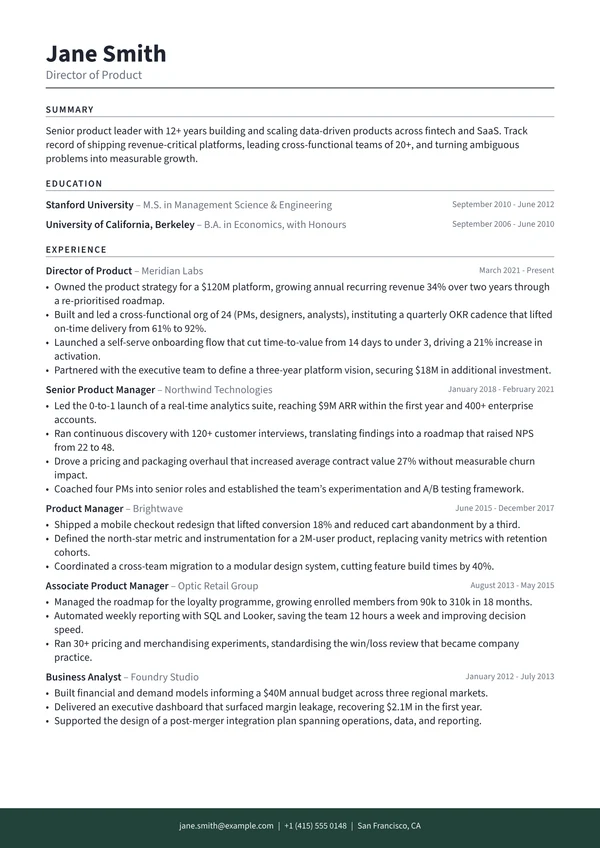
Anchor
A monochrome page anchored by one band of colour at the foot
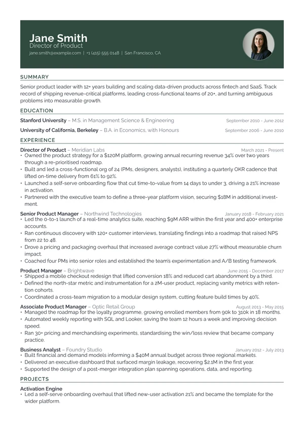
Banner
A full-width accent band carrying the name in white
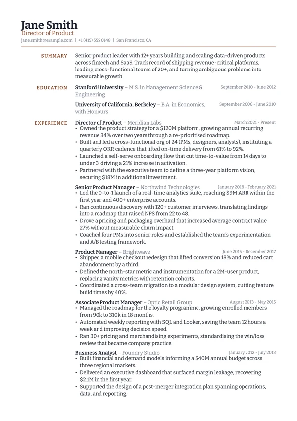
Caption
Section labels set as margin notes beside the content
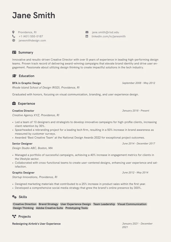
Creative
Warm beige ground with clean grotesque typography
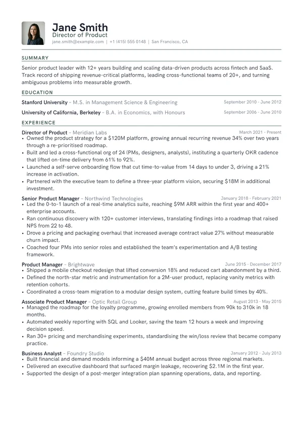
Emblem
A filled accent monogram anchoring a clean single column
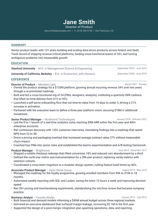
Horizon
A full-bleed accent header band across the top of the page
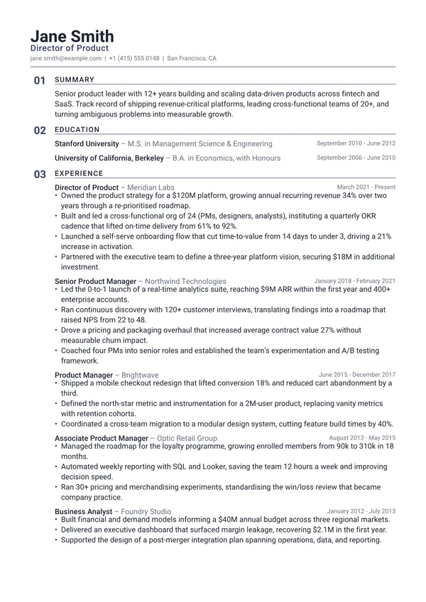
Index
Numbered sections in a Swiss editorial index
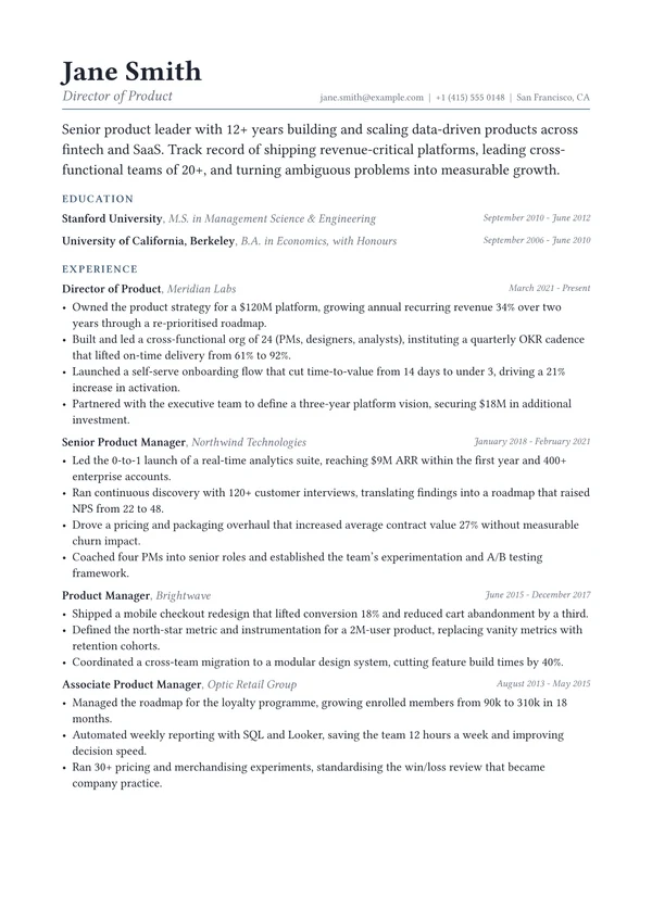
Preface
The profile set as a magazine lede, no label needed
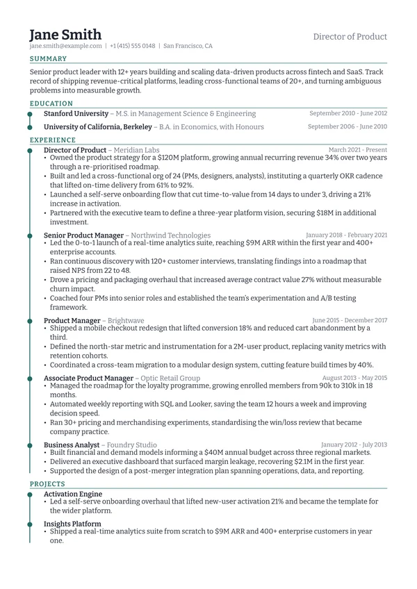
Timeline
A vertical timeline with an accent node marking each role
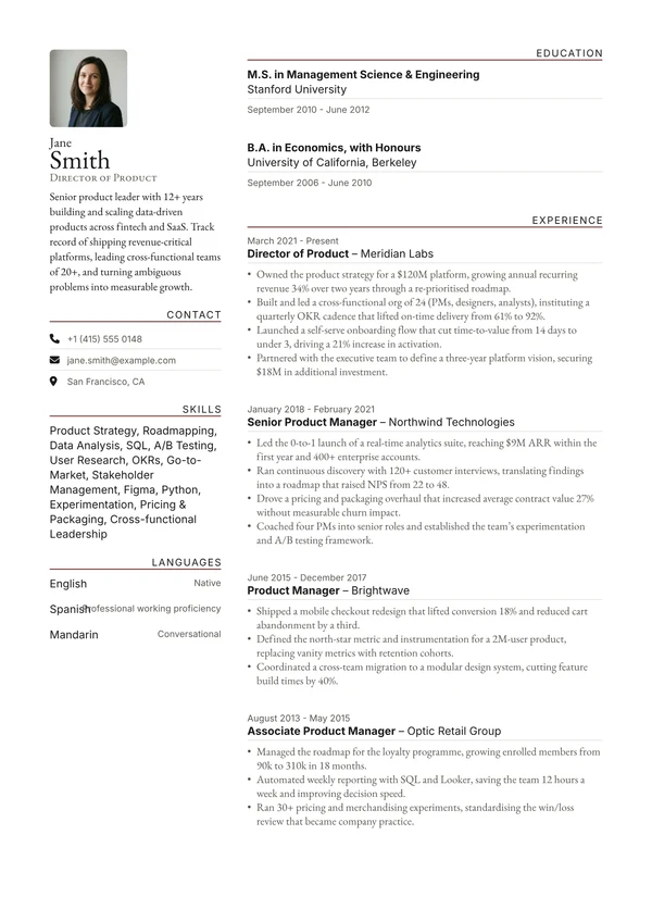
Typographic
An editorial masthead with an oversized last name
Should I use a creative resume template?
Creative here means a deliberate typographic idea, such as an oversized masthead, margin notes or a monogram, rather than graphics and colour for their own sake. That distinction matters: a CV that is hard to read is not creative, it is just harder to read. Use these when you are applying directly to a person, and keep a plainer version for portal applications.
Other styles
- Professional resume templatesDesigns that read as considered and credible in an ordinary hiring process, without asking the reader to admire them first.
- ATS-friendly resume templatesLayouts built to survive applicant tracking software: no colour fills behind text, a clean reading order, and standard section headings.
- Simple resume templatesUncluttered designs that put the writing first, for when a plain, easy-to-read CV is exactly what the job asks for.
- Modern resume templatesContemporary layouts that look current without looking like a novelty, using colour and space rather than ornament.
- Minimalist resume templatesWide margins, hairline rules and a lot of air. Designs where the space is doing as much work as the type.
- Basic resume templatesPlain, no-nonsense designs with no colour blocks, no sidebars and no surprises. The safest thing to send.
- Student resume templatesLayouts that work when education is the strongest section and work experience is still short.
- Graduate resume templatesDesigns for the first proper job: enough structure to look serious, enough space that a short history does not look thin.
- Academic resume templatesFormats built for publications, teaching, funding and the longer record an academic application needs.
- One page resume templatesDenser designs that fit a full career onto a single page without dropping to an unreadable type size.
- Two column resume templatesSide-by-side layouts that keep contact details, skills and languages visible while experience runs full length.
- Executive resume templatesFormats for senior appointments, where the record is long and the tone needs to carry authority.
- Classic resume templatesTraditional structures done properly: serif type, small-caps headings and fine rules, without looking dated.
Frequently asked questions
Should I use a creative resume template?
Only if visual judgement is part of the role and a human is the first reader. Design, art direction, editorial and studio applications are the clear cases. If the application goes through a large employer's portal or a recruitment agency's system, send a plainer version instead, and keep the creative one for direct approaches and your portfolio.
Are these resume templates free?
Yes. Preview any template with your own CV, and start your CV here to download that design free. The other designs need Pro.
Can I edit a resume template after I download it?
Yes. Your CV stays in your account, so you can rewrite the content, change the font size and spacing, and download a fresh PDF whenever you need one.
Will these templates pass an ATS?
The designs marked ATS-friendly are built for it: no colour fills behind text, a clean reading order and standard section headings. Any CV you build can also be checked against a real parser with our free ATS resume checker, which shows you exactly what a screening system extracts.
What file format do I get?
A print-quality PDF, which is what nearly every employer and application portal asks for. The PDF keeps a real text layer rather than being an image, so screening software can read it and so can a screen reader. Pro adds a Word .docx export for the applications that ask for one.
Can I write my resume in a language other than English?
Yes. The AI writes in 36 languages. Japanese, Korean and Chinese are typeset with the right fonts, and the regional formats are built in: Europass, the Japanese rirekisho and shokumu keirekisho, and the Korean iryeokseo.
Should I put a photo on my resume?
In the UK, Ireland, the US, Canada and Australia, no. Employers there usually prefer no photo, and some screening processes strip them to reduce bias. In much of continental Europe and parts of Asia a photo is still conventional. Check the norm where you are applying, and leave it off if you are unsure.
Are these resume templates open source?
The Typst source behind every design is public. Each one is a single .typ file you can download from its own page or read in the template repo on GitHub, and it compiles standalone with Typst 0.12 or newer. Most are MIT-0, and the few that are ports of existing Typst packages stay under their original licence, which the file itself states. Some are also being published as packages to Typst Universe.
How long should my resume be?
One page if you have under roughly ten years of relevant experience, and always for students and graduates. Two pages are normal for senior, academic or highly technical roles. An academic CV is the exception and runs as long as your publication and funding record requires.