Two column resume templates
Side-by-side layouts that keep contact details, skills and languages visible while experience runs full length.
Two column resume templates
8 designs
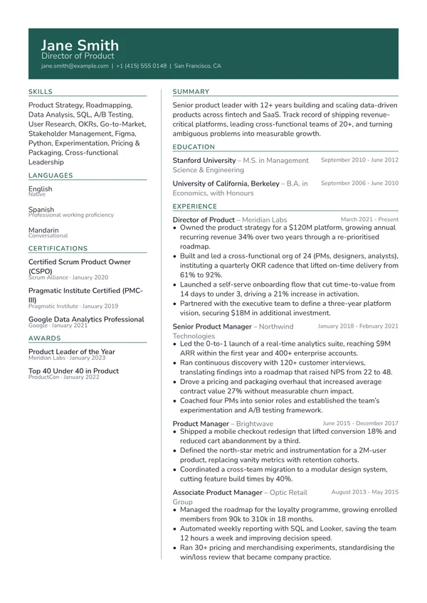
Atlas
An accent header band above an uncoloured two-column body
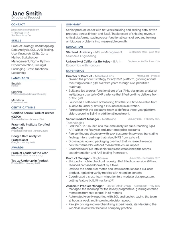
Column
An uncoloured two-column layout built to parse cleanly

Executive
A two-column senior CV in the moderncv tradition
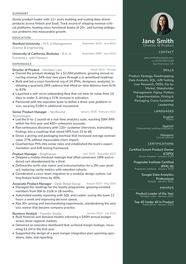
Harbor
A deep-accent sidebar on the right, not the left
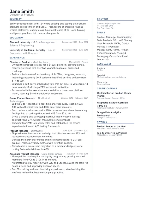
Margin
An uncoloured two-column layout with the meta rail on the right
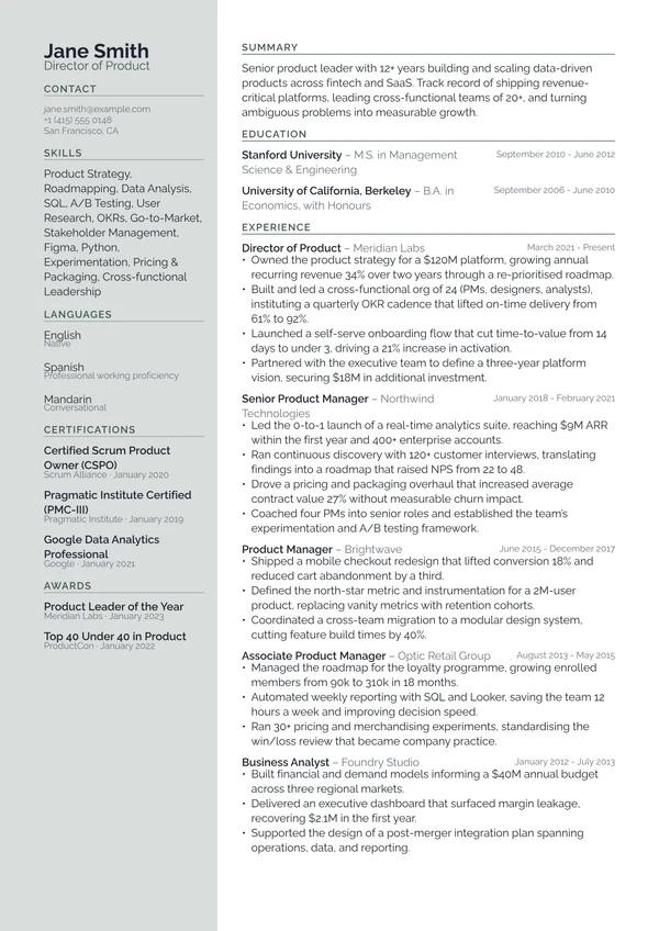
Quartz
A softly tinted left rail instead of a saturated sidebar
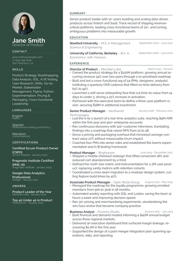
Slate
A full-height deep-accent sidebar carrying contact and skills
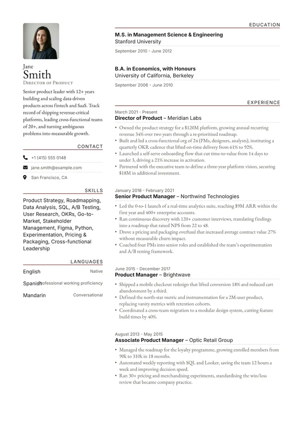
Typographic
An editorial masthead with an oversized last name
Are two column resumes bad for ATS?
Two columns buy you density, but they cost you parsing reliability if the design puts text inside a coloured fill. The collection includes both kinds: saturated sidebars for when a person is definitely reading first, and uncoloured rails for when the application goes through screening software. If you are not sure which applies, pick an uncoloured one.
Other styles
- Professional resume templatesDesigns that read as considered and credible in an ordinary hiring process, without asking the reader to admire them first.
- ATS-friendly resume templatesLayouts built to survive applicant tracking software: no colour fills behind text, a clean reading order, and standard section headings.
- Simple resume templatesUncluttered designs that put the writing first, for when a plain, easy-to-read CV is exactly what the job asks for.
- Modern resume templatesContemporary layouts that look current without looking like a novelty, using colour and space rather than ornament.
- Minimalist resume templatesWide margins, hairline rules and a lot of air. Designs where the space is doing as much work as the type.
- Basic resume templatesPlain, no-nonsense designs with no colour blocks, no sidebars and no surprises. The safest thing to send.
- Student resume templatesLayouts that work when education is the strongest section and work experience is still short.
- Graduate resume templatesDesigns for the first proper job: enough structure to look serious, enough space that a short history does not look thin.
- Academic resume templatesFormats built for publications, teaching, funding and the longer record an academic application needs.
- One page resume templatesDenser designs that fit a full career onto a single page without dropping to an unreadable type size.
- Executive resume templatesFormats for senior appointments, where the record is long and the tone needs to carry authority.
- Classic resume templatesTraditional structures done properly: serif type, small-caps headings and fine rules, without looking dated.
- Creative resume templatesDistinctive designs for when a person is definitely reading first and visual judgement is part of the job.
Frequently asked questions
Are two column resumes bad for ATS?
Not inherently. What causes problems is text sitting inside coloured shapes, and reading orders that interleave the columns so unrelated lines end up adjacent in the extracted text. An uncoloured two-column layout with a clean reading order parses close to as well as a single column. A saturated sidebar carries real risk, so save those for applications you know a person reads first.
Are these resume templates free?
Yes. You can fill in a template, preview it and download a PDF without paying. A JobSprout account is free, and some of the designs are marked Pro, which unlocks with a subscription. There is always a free design available in every style.
Can I edit a resume template after I download it?
Yes. Your CV stays in your account, so you can change the content, switch to a different design, adjust the colour, font size and spacing, and download a fresh PDF whenever you need one. Switching design never loses your content, because the content and the layout are stored separately.
Will these templates pass an ATS?
The designs marked ATS-friendly are built for it: no colour fills behind text, a clean reading order and standard section headings. Any CV you build can also be checked against a real parser with our free ATS resume checker, which shows you exactly what a screening system extracts.
What file format do I get?
A print-quality PDF, which is what nearly every employer and application portal asks for. The PDF keeps a real text layer rather than being an image, so screening software can read it and so can a screen reader.
Should I put a photo on my resume?
In the UK, Ireland, the US, Canada and Australia, no. Employers there usually prefer no photo, and some screening processes strip them to reduce bias. In much of continental Europe and parts of Asia a photo is still conventional. Check the norm where you are applying, and leave it off if you are unsure.
How long should my resume be?
One page if you have under roughly ten years of relevant experience, and always for students and graduates. Two pages are normal for senior, academic or highly technical roles. An academic CV is the exception and runs as long as your publication and funding record requires.